Southdown Institute
Southdown Institute was founded to address the needs of religious and clergy around addictions and mental health issues.
Bringing enlightenment to their design was our goal.
The Challenge
In 2013, after working together at another company for several years, I was hired by Southdown Insitute’s newest Communications Manager. In anticipation of moving into their beautiful new, building, they wanted a new design for the marketing material–as fresh and new as their custom building, and a new designer to go with it. The logo wasn’t changing, and the new material had to elevate the existing logo design.
The Solution
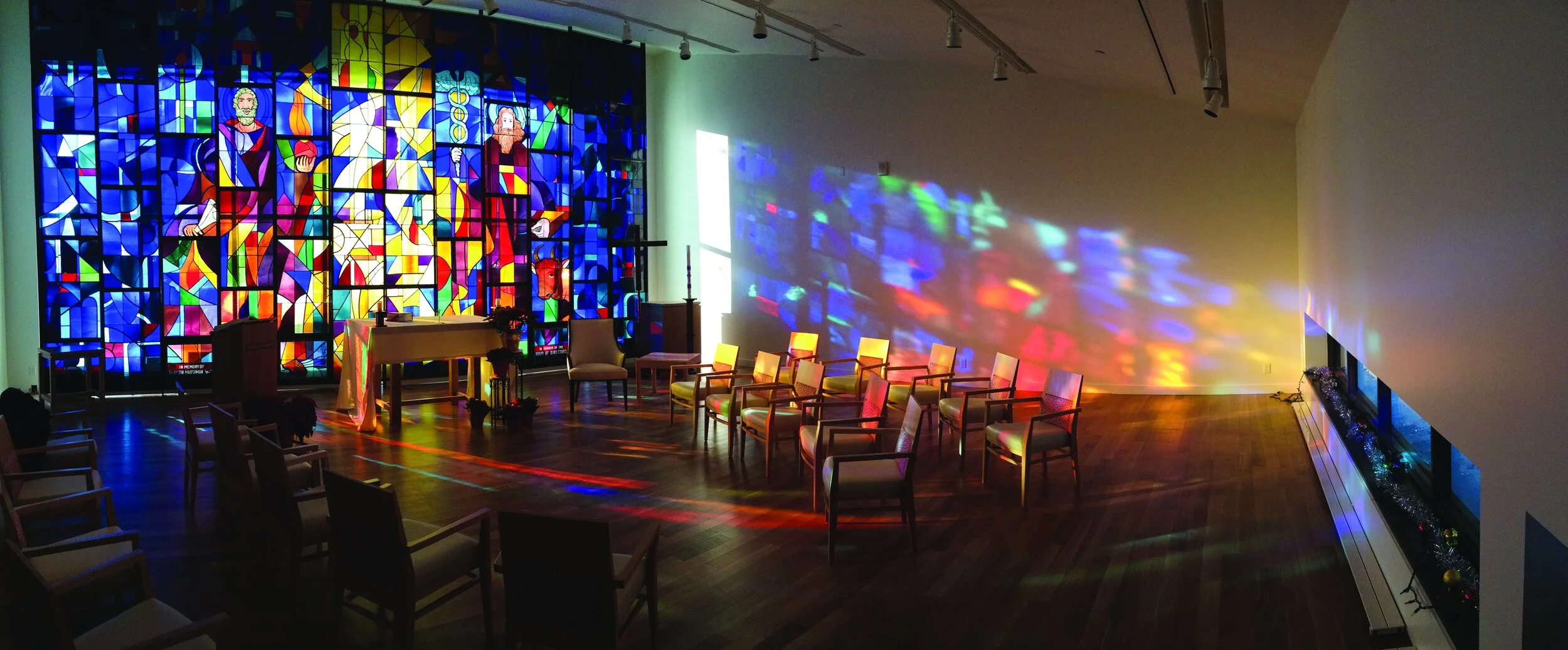
The one constant at the new location was the stained glass window. Brought in from their previous location, it was a focal feature. I wanted the stationery to have a design element that spoke to this. The stained glass window inspired the overlapping colours, and this motif inspired every piece that we created.
The stationery's rounded/square corners are a nod to the existing logo that also contains 1 straight and 3 rounded corners. This was a great way to add a modern, unexpected element to the pieces.


